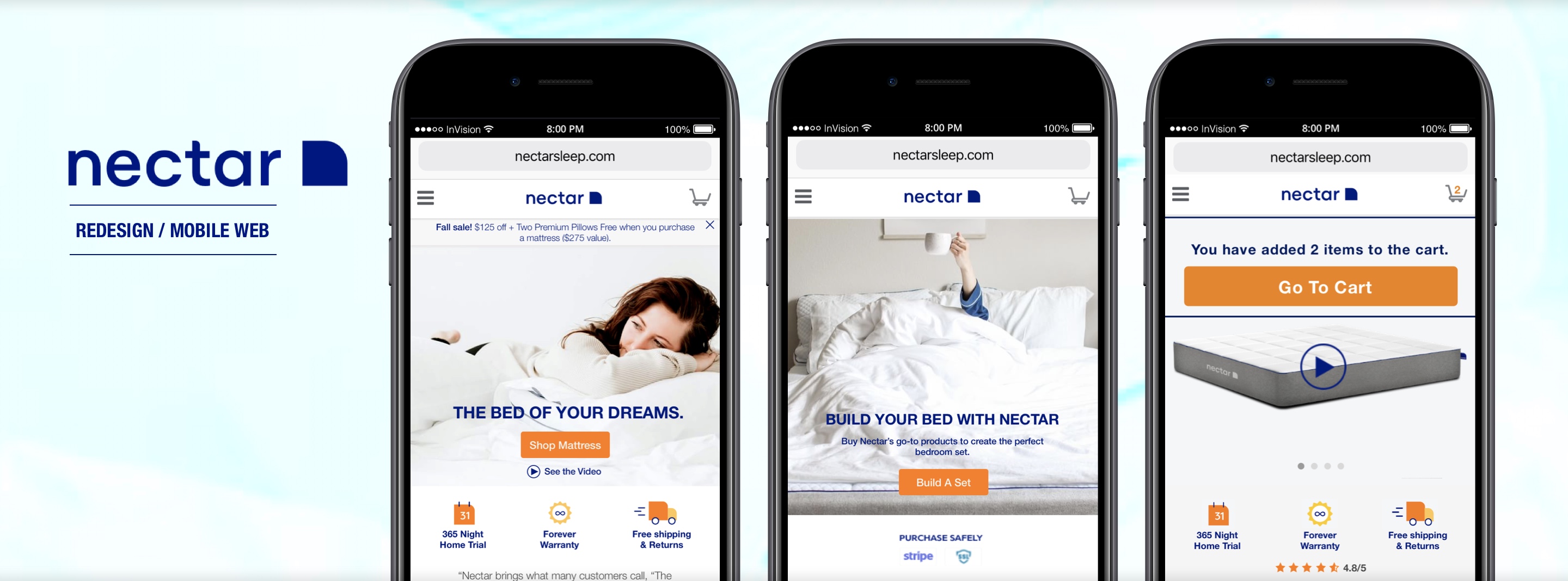

Nectar is the third largest online mattress company. We provided them with a mobile web redesign proposal that improves site’s usability and effectively raises online sales and brand value.
RESEARCH & SYNTHESIS
First, we set out to collect all relevant data through various research methods. We interviewed Nectar’s user base to learn about their needs from an online store. We studied online mattress industry and Nectar’s competition in the field. And we analyzed and tested Nectar’s site for usability issues and compared its performance and features with its closest rivals in the industry.
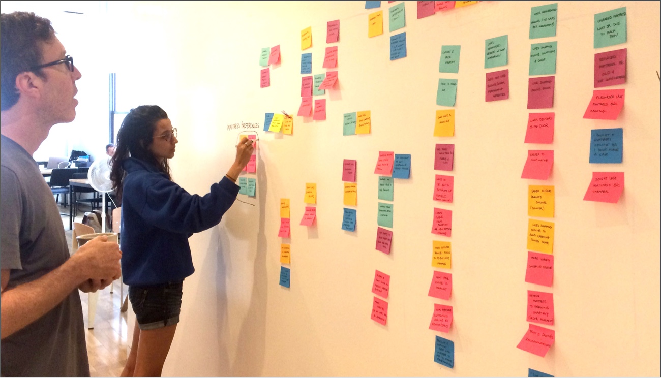
Finding patterns and insights through Affinity Mapping
USER INTERVIEWS
Interviewed 5 users from Nectar’s target user base - urban area millennial with extra money at their disposal. We learned that most users like free shipping and return on bulk items. They prefer to buy items on mobile app as opposed to mobile web browser. And they are frustrated by lack of space and the constant need to scroll on website.
KEY INSIGHTS
of users buy bulky items online if they get free shipping & return

of users like organized information without distractions on websites
of users don't purchase on mobile web browser (prefer mobile app)
USER QUOTE

If they have an app, I use that.
App seems more user friendly.. more secure.-Mady
COMPETITIVE FEATURE ANALYSIS
We compared mobile website features between Nectar and its top two competitors - Casper and Purple Mattress. We found that Nectar is missing some important features as compared to its rivals.
KEY INSIGHTS
- NAVIGATION - All Nectar products are not available in the global navigation but only accessible through the footer.
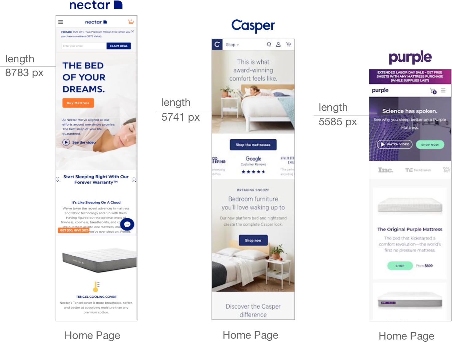
- LAYOUT - Nectar home page requires 35% more scrolling. Content is not designed for the mobile space.
- CHECKOUT - Nectar lacks a cart interface to display purchased items. Users are taken straight to the chekcout page which is confusing.
Nectar Home Page requires 35% more scrolling than Casper and Purple

HEURISTIC ANALYSIS
We conducted heuristic analysis with the Abby Method (10 heuristic Information Architect principles) to test the usability of the current Nectar mobile website.
ABBY METHOD
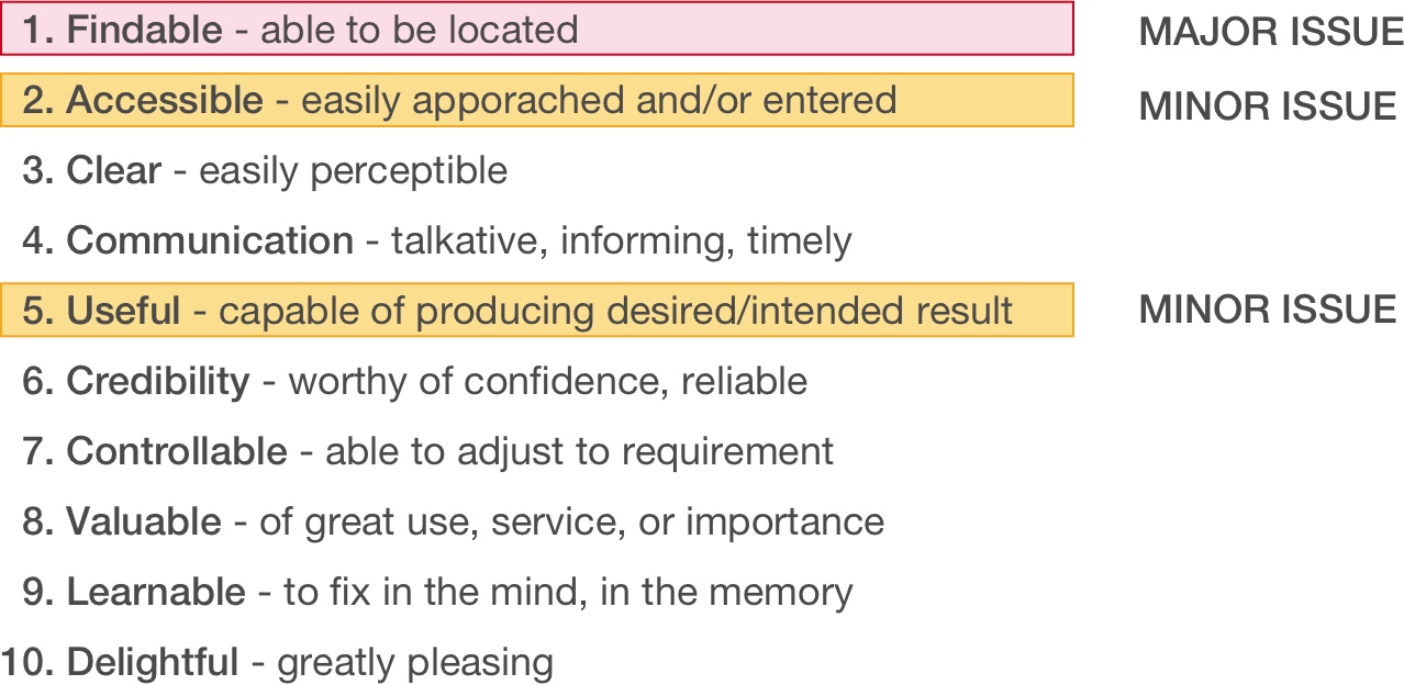
KEY INSIGHTS
- NAVIGATION is poorly organized. Redesign primary navigation to include all the products to improve Findability and Accessibility.
- LAYOUT could be better organized. Simplify design and organization to to remove redundancy and unnecessary scrolling.
- CHECKOUT flow is confusing without a shopping cart. Redesign the flow with a shopping cart to avoid confusion and frustration.
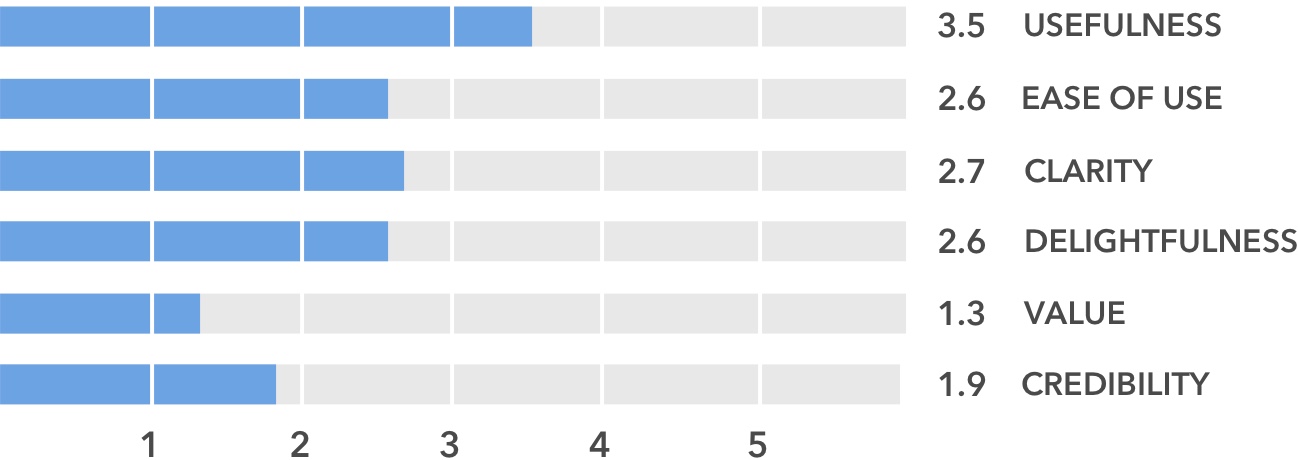
USABILITY TESTING (CURRENT SITE)
Conducted live usability testing via usertesting.com with 5 users for both desktop and mobile site for Nectar, Casper and Purple.
USER TASKS

You are looking to purchase a pillow. So, find one and add it to the cart.

You are looking for a mattress and not sure whether you need a California King or a King. Find out about both.

Shop for a mattress and a foundation and add to your cart.
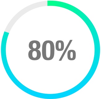
KEY INSIGHTS
of users said they felt being forced to checkout (no cart)
of users said content was poorly organized (repetitive info, scrolling)
of users felt navigation is not clear - does not include all the products.
USER QUOTES
LIKERT SCALES
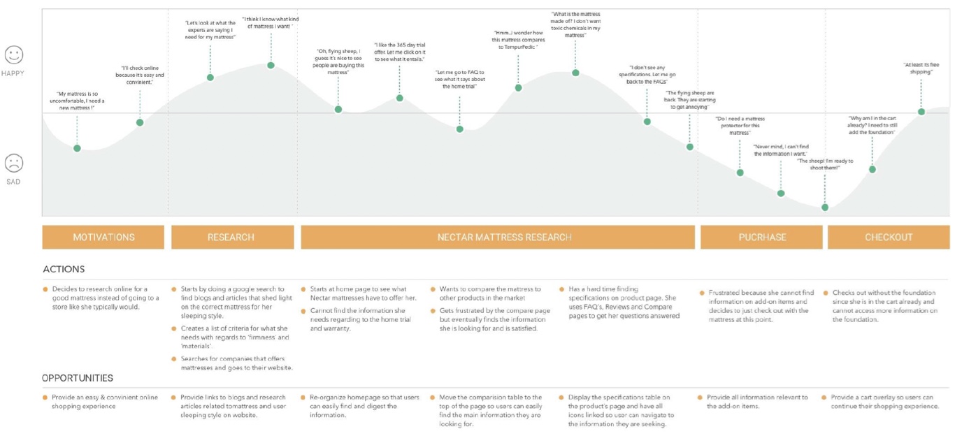
USER JOURNEY MAP
Based on the persona and the usability test results, we created a user journey map that highlights Mady’s experience while interacting with the Nectar website. It illustrates both highs and lows of her journey as well as the opportunities to address her pain points.
Scenario: Mady is a nurse at the Ohio Hospital who usually works 80 hours a week. She is in the market for a new mattress and wants to purchase it online; however, she doesn't know what she really needs in her mattress. So far, she's been frustrated with finding all the information she needs for the right mattress.
PROBLEM STATEMENT
Mady has a difficult time finding all information needed to purchase a mattress on Nectarsleep.com.
How might we redesign the website so Mady can easily find information needed to decide and purchase various products on the website?
DESIGN: IDEATION & ITERATION
To help Mady easily find information to shop on Nectar’s website, our research clearly points to several key categories. Redesign primary navigation so Mady can access all products easily. Design a mobile appropriate layout by removing redundancies and unnecessary elements so Mady doesn’t have to scroll a lot to find information. And finally, improve the checkout flow by adding a cart overlay when user adds items to a cart. This allows them to continue adding other products and not feel forced to checkout.
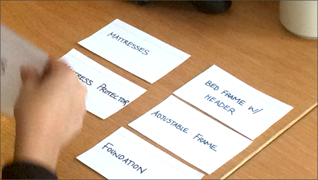
Card sorting helps to see how the user would organize products in navigation
GLOBAL NAVIGATION: INTUITIVE AND ACCESSIBLE
We redesigned global navigation so that Mady can easily access all products. We added products accessible only in the footer to the global navigation. And we conducted an open card sorting with 5 users to understand user mental model of products and their categories. We used data and insights from the card sorting to help us design a navigation that would be intuitive for Mady.
PROPOSED SITE MAP
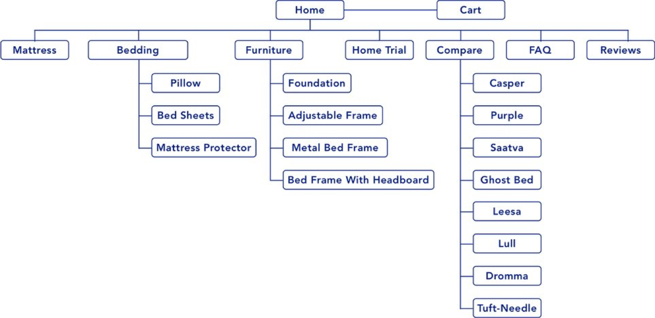
PROPOSED NAVIGATION DESIGN
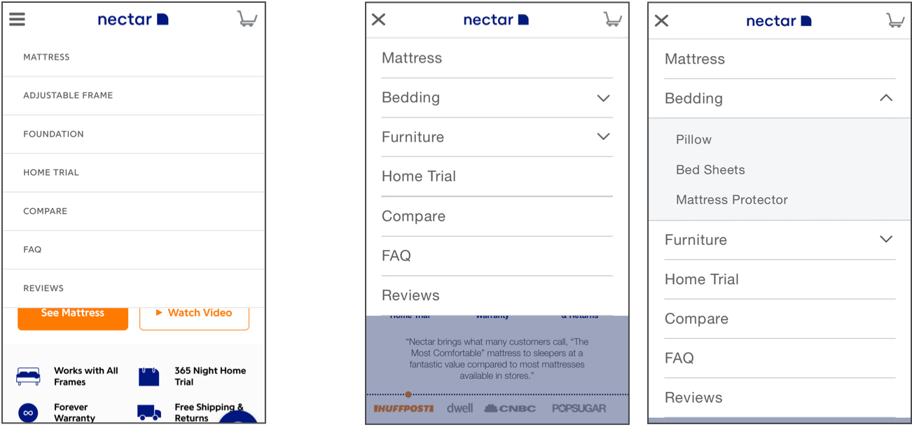
Current Global NavigationNew Global Navigation with all products and new categories
LAYOUT: DESIGN FOR MOBILE SPACE
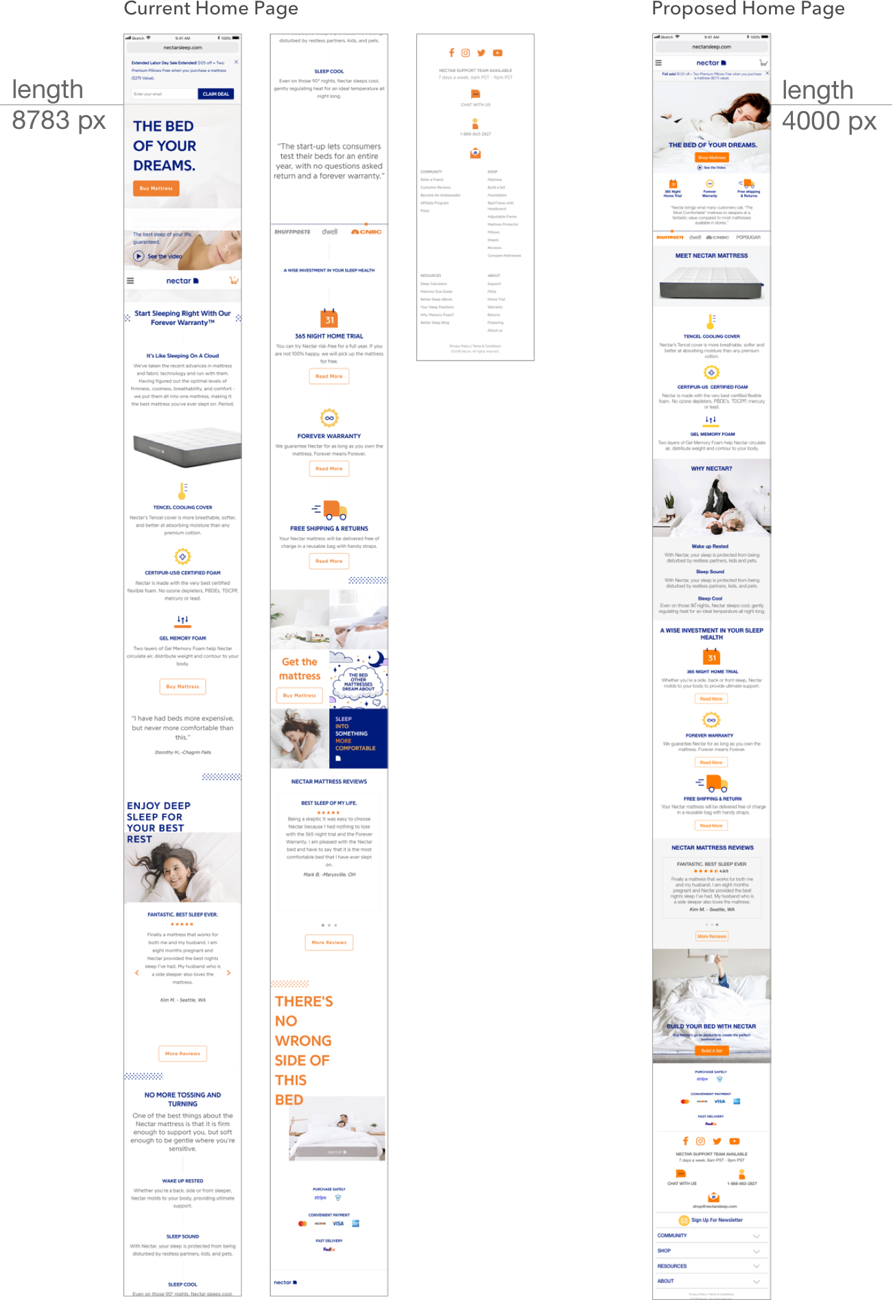
We redesigned content and layout of the home and product pages to help Mady quickly get to the most important content she needs to make her decisions. We removed all unnecessary white space and decorative elements. We made the image dimensions more appropriate for mobile so they don’t take too much space. We removed all redundant content and consolidated them under clear logical categories. We added background photos and color for clear division of content so Mady can quickly scan the content. And finally we used expandable headed sections to keep content compact giving Mady the option to explore details as needed.
PROPOSED LAYOUT: 45% LESS SCROLLING ON HOME PAGE
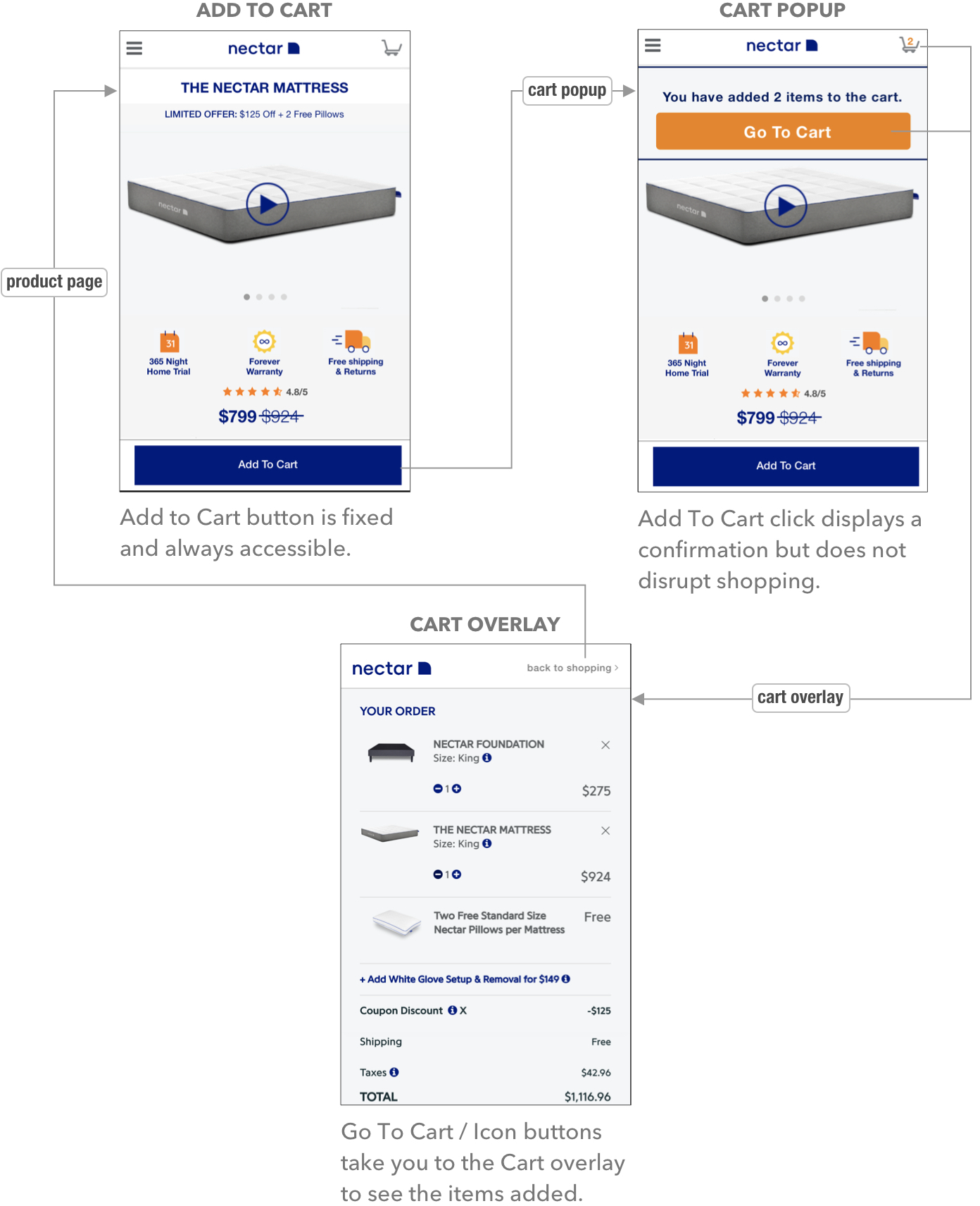
CHECKOUT FLOW WITH CART
Nectar site currently takes Mady straight to the checkout page when she adds an item to the cart. This creates confusion because she expects from online shopping experience that her item should be added to a shopping cart. It also disrupts her shopping experience because she has to go back from the checkout page if she wants to continue shopping. This is frustrating to her.
CURRENT CHECKOUT FLOW
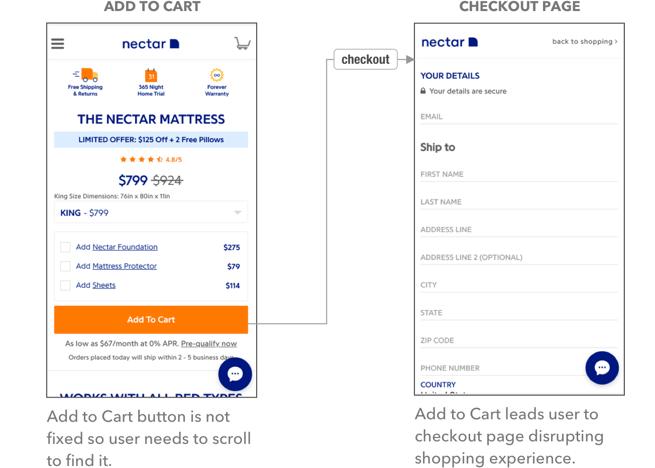
PROPOSED CHECKOUT FLOW
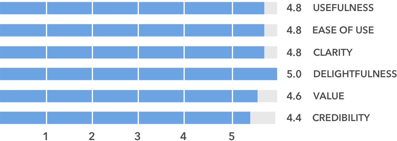
USABILITY TESTING (PROPOSED PROTOTYPE)
Live usability tests were conducted with 5 users on a high-fidelity prototype at usertesting.com to validate design decisions. Users completed all 3 tasks given without any of the issues they experienced in the current site usability tests. Results in comparison are dramatically more positive.
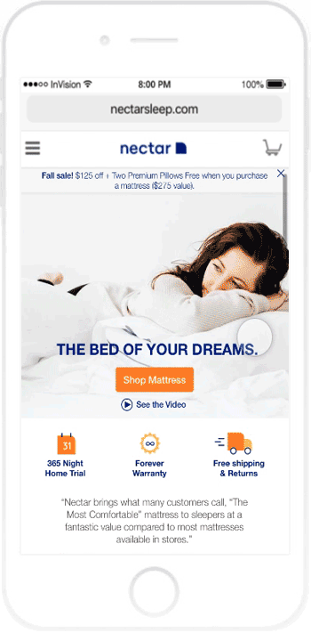
HOMEPAGE (PROTOTYPE)
LIKERT SCALE (PROTOTYPE)
USER QUOTES (PROTOTYPE)
KEY TAKEAWAY
One of the key insights from our user interviews was that most prefer to shop on mobile apps rather than on mobile web sites. They complained of the incessant scrolling and irrelevant content. Once we addressed this issue by our redesigned mobile experience - the response turned around completely. This shows that content and layout design should be device specific and not just responsive dimension of the desktop content.
UX Methods
Business Research
User Interviews
Affinity Mapping
Competitive Feature Analysis
Persona Development
Heuristic Analysis
Site Map
User Journey Map
Design Studio (with client team)
Wireframing
Rapid Prototype
Usability Testing
Specification Documentation
Team
Dhwani Krishnan
Kevin Regan
Zameer Rehmani
My Roles
UX Researcher
UX/UI Design
Tools
Sketch
InVision
Adobe CS
Timing
2.5 Weeks Sprint